Plex has revealed that a reimagined and improved user experience will roll out in early 2025, with redesigned navigation, expanded use of artwork and more.
Among the changes is a new structure that allows existing users to navigate more intuitively and gives new users a clearer sense of what Plex is all about. The app’s core features have been brought to the forefront, and media libraries have been centralized into a dedicated tab, with the option to favorite libraries and easily access power-user features. Watchlist has also been given its own dedicated spot in the top navigation.
The update also includes streamlining the user menu, where users can quickly access their personalized details such as their profile, watch history, friends and streaming services all in one place.
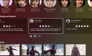
Also, the redesign has expanded the use of artwork throughout the app. More artwork is featured in movie and show detail pages, cast and crew profiles and on users’ own personal profile pages.
Plex rewrote its apps from the ground up to unify its codebase and create a streamlined, consistent experience across platforms.
The update is available as an early-access preview right now to gain more feedback from users. It will be available to everyone in early 2025.


